Saturday, 18 April 2015
Evalution 2: How does your media product represent particular social groups?
The postures of both
people are slightly similar because, we are both sitting down and it appears
that Mark Ronson is looking directly at the camera. However, the positioning of
our arms is different. My positioning suggests that I am more serious, whilst
Ronson’s suggest that he is carefree. Our facial expressions suggest the same
thing. Also, our gestures are differing as well. My gesture suggests that I am
ready to face the questions that I was going to be asked. Ronson, on the other
hand, appears to be uninterested in answering questions and appears to insist
that the interview happens on his terms.
We are both wearing
dark clothing, which suggests that the music genre we specialise in is similar
(i.e. if I was wearing bright clothing, it would suggest that I would specialise
in pop music). Also, my positioning suggests that I am very serious about
producing good music for my fans, keeping them interested or perhaps attempting
to attract more fans. However, Ronson appears to simply enjoy making music and
isn’t actively seeking a fan base. Instead, he appears to allow the reader to
make a judgement on whether they will follow him or not and that he wouldn’t
care either way.
In conclusion, I
think that both images possibly represent the ‘emo/hippie’ social group
because, of our dark clothing, the genres of music we specialise in (rock, jazz
and funk) and our facial expressions (serious and carefree). The reason why I
brought two different social groups together is because, they are both
associated with individualism. Both are unique, stand out and often challenge
social norms.
Friday, 17 April 2015
Thursday, 9 April 2015
Third Draft (Double Page Spread)
I have now received feedback on my double page spread for my AS Media coursework that will enable me to carry out the third and final draft.
To carry out the third draft, I will rearrange the location of the article title and move it to the left hand side of the page to make my double page spread look more lively and engaging to the target audience. I am also going to ensure that the article text is organized into columns, as it is currently disorganized and it looks slightly unprofessional and more of a powerpoint presentation than a magazine double page spread.
I am also going to improve upon my editing, as you can still sees aspects of the original image.
Below, is the third and final draft of my double page spread. I only made minor improvements to the double page spread because, I was otherwise satisfied with the finished result of the second draft. For the third draft, I managed to cover the unnecessary background of the original image. I also rearranged the text to make the article look more organised.
Wednesday, 1 April 2015
Third Draft (Contents Page)
This is the third and final draft of the magazine contents page for my AS Media coursework.
The feedback from the second draft stated that I simply needed to add more features because, there was some vacant areas that were large enough for more features to be added.
I agreed with the feedback and I indeed, added more features to make the contents page look more lively and to offer the target audience more choice, as you can see in the comparison images above.
Initially, I found it difficult to undertake the third draft because, I was unsure of what to do. However, I was able to recall current up to date artists in the music industry and then, I started to include more features on my contents page. I also changed the date of the issue from November 2014 to the current moth/year, April 2015.
Third Draft (Front Cover)
I have now received feedback that will enable me to complete the third and final draft of my front cover for my AS coursework.
There are only a few changes that I need to make.
For my third draft, I will include a more broad variety of fonts and ensure that the masthead completely dominates the top of the cover. I could possibly remove the dark box and drag the masthead to the other side of the page.
This is the third draft and the improvements that I have made
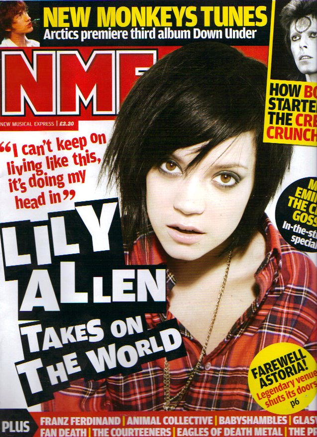
As you can see, I have made several changes to the front cover to make it look more lively. Firstly, I changed the main cover line from red coloured text to white, surrounded by a black box. I decided to make this change after reviewing various front covers from the NME magazine. One particular issue, which had white text surrounded by a black box, which caught my eye, so I decided to use the same format for my main cover line. I also typed the text, using both capitals and small blocks to make it more eye catching to the target audience.
I also included a new section at the bottom of the cover, again to make the cover look more lively and to offer the target audience more to read about. Again, the inspiration from the issue in the image above.
Again to make the magazine look more lively, I enlarged the masthead so that it would dominate the top of the magazine, in order to stand out to the target audience. I also moved all of the sell lines to the left hand side of the page to allow space for other cover lines and images to liven the front cover.
Subscribe to:
Posts (Atom)