Wednesday, 1 April 2015

Third Draft (Front Cover)


I have now received feedback that will enable me to complete the third and final draft of my front cover for my AS coursework.

There are only a few changes that I need to make.

For my third draft, I will include a more broad variety of fonts and ensure that the masthead completely dominates the top of the cover. I could possibly remove the dark box and drag the masthead to the other side of the page.

This is the third draft and the improvements that I have made


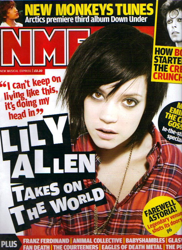
As you can see, I have made several changes to the front cover to make it look more lively. Firstly, I changed the main cover line from red coloured text to white, surrounded by a black box. I decided to make this change after reviewing various front covers from the NME magazine. One particular issue, which had white text surrounded by a black box, which caught my eye, so I decided to use the same format for my main cover line. I also typed the text, using both capitals and small blocks to make it more eye catching to the target audience.
NME

I also included a new section at the bottom of the cover, again to make the cover look more lively and to offer the target audience more to read about. Again, the inspiration from the issue in the image above.
Again to make the magazine look more lively, I enlarged the masthead so that it would dominate the top of the magazine, in order to stand out to the target audience. I also moved all of the sell lines to the left hand side of the page to allow space for other cover lines and images to liven the front cover.


Wednesday, 25 March 2015

Font Styles

The main fonts that I used during the production of my media product, revolved around bold font


For example, for the masthead, I used the font of lowan old style black.
For the cover and sell lines, I used the fonts of Helvetica Neue Bold and Kefa Bold, Marion Bold and Microsoft Tai Le Bold.

The reason why I used bold font was because, it is very distinctive and it instantly catches your eye to the relevant information. Also, bold font is far easier to read and it is more visible. If the font on my front cover was not bold, the text would be incredibly difficult to read.

Colour Styles

The following are the colours that I have selected are the colours that I used for my media product;
Red
Grey
Black and White

This was the colour scheme that I stuck to throughout the development of my media product.

I chose this particular colour scheme because, it is a colour scheme that similar magazines use such as Q and NME follow and I am attempting to appeal to a similar audience to the target audience of Q and NME.

This an example of a colour scheme from Q magazine.


As you can see, the dominant colour is red. I decided to make red the main colour because, it is bright and it can be instrumental in instantly attracting the readers attention.


Black is another colour that is featured prominently in both this image and my own media product.
I decided to use the colour black because, it is a colour that is associated with the rock, indie and r&b genre.


Monday, 9 February 2015

Second Draft Feedback (Front Cover)


I have now received feedback for the second draft of my front cover.

I received less feedback for the second draft because, it is significantly better than the first draft and it looks more professional.

The only feedback (to improve upon) of any significance that I received was about the masthead. I was told that I could remove the box and increase the the size of the actual masthead 'Top Spot' so that it is the length of the top of the page. If I was to make this improvement, I don't think that it would really fit in with the rest of the front cover. I also don't think that you would be able to see the masthead because, the background colour would be too bright and as a result, the masthead would look too bright as well.

I was also told that I could place a black box over the skyline, 'the best talent for the best readers!' because, most magazines use this on their front covers.
Again, I was told to use a wider variety of fonts because, they all looked to similar to one and other.

Second Draft (Front Cover)


This is the second draft of the front cover for my AS Media coursework. As you can see, I have significantly improved aspects of my front cover to improve its quality.

I have decreased the size of the essential information and now, it doesn't overshadow the rest of the front cover. Generally, I have decreased the size of the font to include more cover lines to offer a broader choice for the target audience. I have also changed the colours to determine a clearer colour scheme to my magazine. That colour scheme is black, red and white. Q and NME follow a similar colour scheme and these are the magazines that have inspired mine.

I have also completely changed the main cover line. I have changed the content to give a clearer indication to the target audience as to what the main article is about. I also changed the colour of the text so that it fitted in with the colour scheme. The previous colour was yellow and it stood out like a sore thumb.

The most distinctive change that I have had made to the front cover is the masthead. I have changed the colours so that it would fit in with the background colour and I have increased the size of the box and the text to make it look more professional.

Overall, I am very happy with the finished result of this front cover. I should receive better feedback and better marks for my coursework.

Monday, 2 February 2015

Double Page Spread


This is the first draft of the magazine double page spread for my AS media coursework. This is the third and final component of my coursework. I had to write an article that was suited the theme and the target audience of this magazine. My magazine is inspired by the likes of NME, Q, Kerrang.etc and its content normally consists of musicians of a rock/indie/songwriter genre, slating other people in the music industry and bragging about their drug and alcohol lifestyle.

Surprisingly, I found the double page spread the easiest to develop out of the three components and that was because, I didn't have spend a large amount of time placing boxes in certain places. All I needed to do was write in the text, which I got from my double page spread draft on blogger. I wrote a draft because, it was a forum where I could type down ideas for the article.

Overall, I think that I have done very well in this aspect of my coursework. I think that the double page spread looks very professional because, of the colours used. The inspiration for my magazine, NME possesses similar colours to the ones I have used. I also think that you would find an article that looks similar to this in a professional music magazine.

I think that the only thing I would improve upon is the way I edited the image into the page. This is because, you can still see parts of the background of the original photo so it is more obvious that it is edited. The image doesn't really look professional. I edited the background by dragging several grey coloured boxes onto the page.

In order to undertake this task, I researched professional double page spreads from NME, Q and Kerrang for inspiration. I was researching what the layout of a double page spread looks like and what the content is. I found that in a double page spread, the image was located on one side of the page and all of the text was located on the other side. I decided to use this format because, it has appeared in most music magazines. The content mainly consisted of the act telling the interviewer about his/her upcoming album and I have stuck to this content for my article.

Monday, 26 January 2015

Double Page Spread draft


This is the draft for the article in my double page spread. I am undertaking this task because, it is a platform of ideas for the final product. I have decided to use the question/answer format for my article because, it is straight to the point and it provides the reader with more clearer and direct information.

How does it feel to be nominated for the Critics Choice Award at this years Brit Awards?
It feels great because, I see this award as a springboard for a successful career. Although I do appreciate the fan base I already have, but its not exactly going to earn me millions or send me around the world on tour is it? I won't be necessarily bothered if I don't win because, I'm already signed to a label and I'll still be releasing my album anyway. This award is basically a cheating method for artists to break into the charts, but you can't exactly deny the facts.

Tell us about your upcoming album.
It is called Worldwide to represent my hopes of becoming a worldwide success and I also think that the name has a good ring to it. It's full of songs that I've written over the years that have all been inspired by the likes of Oasis, Coldplay, as in their first two albums, and the Red Hot Chilli Peppers. I've spent the last year hiding the wilderness of a London studio, which has been an absolute nightmare for me because, London is like a holiday destination to me. I was surrounded by all of these pubs and nice restaurants and so on, so me and my band had difficulty concentrating.

What are your hopes for the future?
The ultimate goal is to have billions of dollars, my own flat in a spaceship, a spare room in the Playboy mansion and play Batman in his three hundredth film. Talking in terms of music, I'd like to have number 1 singles, number 1 albums, sell out tours, arenas or any establishment where people gather to see live music. I also want to be up there with the likes of Bob Dylan, Nirvana, Oasis, Coldplay, Robbie Williams and so forth. I wouldn't mind winning a few Brit Awards, have a few drunken rants and call those acceptance speeches and I think that would really liven that place up because, it hasn't made interesting viewing at all these past few years since nobody can get drunk anymore. However, I would still like to achieve the ambitions outside of music of course.

How has the journey been so far?
Well, it hasn't exactly been a walk in the park as I am not a popstar. I am a serious musician, but for some reason, we're not very well liked by the music industry. Maybe, it is because, everyone is jealous of our talent who know's? Subsequently, I have been rejected by countless major labels and it has really knocked my confidence, but you can't give up your passion, no matter how many people tell you that you're wasting your life.

What is your current take on the current direction the music industry is going in?
I don't really like it to be honest because, it seems that everyone has sold their soul. People like Adele, Ed Sheeran, Professor Green and Coldplay have all lost their way and I fear that they may never find their way back to how good they once were. I only liked Coldplay's first two albums and I liked Ed Sheeran and Adele before they became untouchable. As for Professor Green, he lost all credibility from me as a rapper when I saw him perform on the National Lottery over Christmas. I mean, you wouldn't see Eminem dead doing that, would you? I guess I have this view because, I am not a mainstream person and all of these people are now mainstream. However, I must stress that we need new groundbreaking Eminem's instead of all those rappers rapping about the same thing. We've heard enough of all of that. We need to hear rhymes that affect us. We also need new Michael Jackson's, Craig David's, new Coldplay's, a new Sex Pistols and so forth. It is vitally important that the music industry stays young and ever-changing to fulfill certain roles, certain genres. Otherwise, it would become a laughing stock, full of aging artists trying to act all cool and young.